Color Theory: How to Choose the Right Palette for Your Forever Home
Color is one of the most powerful tools in interior design. It shapes mood, influences light, and determines whether a home feels calm and cohesive…or chaotic and disconnected. Yet so many people choose paint colors completely backward. They start with a trendy shade, or copy a room they saw online, or try to build an entire palette around a single pillow. Color theory offers a smarter approach. When you understand the foundations of how color actually works, you stop guessing and start designing with real clarity. Here's what to know before you begin selecting colors for your home.
Understand the color wheel
At its most basic, color theory begins with the color wheel. Primary colors (red, blue, yellow), secondary colors (green, orange, purple), and tertiary colors that combine the two. In interiors, we rarely use bold primary colors in large doses. Instead, we work with softened, muted variations of them. But understanding the relationships between colors is what really matters. Complementary colors, which sit opposite each other on the wheel, create contrast and energy. Analogous colors, which are neighbors on the wheel, create harmony and flow.
Monochromatic palettes use varying shades of a single hue for subtle sophistication. Forever homes tend to lean toward analogous or monochromatic palettes because they feel layered and cohesive over time rather than visually demanding.
Download the free guide, Why Your Home Still Feels Unfinished, the simple, designer-approved guide that shows you the exact three things to fix first in your home.
Temperature matters more than you think
Every color has a temperature. Warm tones carry yellow, red, or orange undertones, while cool tones lean toward blue, green, or gray. This even applies to white paint, which is where a lot of homeowners get tripped up. One of the most common mistakes is mixing warm and cool undertones unintentionally. A cool gray sofa paired with warm creamy walls can feel subtly off even if you can't immediately put your finger on why. Before selecting finishes, decide on your home's overall temperature direction. Warm homes feel inviting and soft; cool homes feel crisp and tailored. This choice is a personal preference. There isn’t a right or wrong temperature direction. The only wrong choice is lacking consistency.
Light changes everything
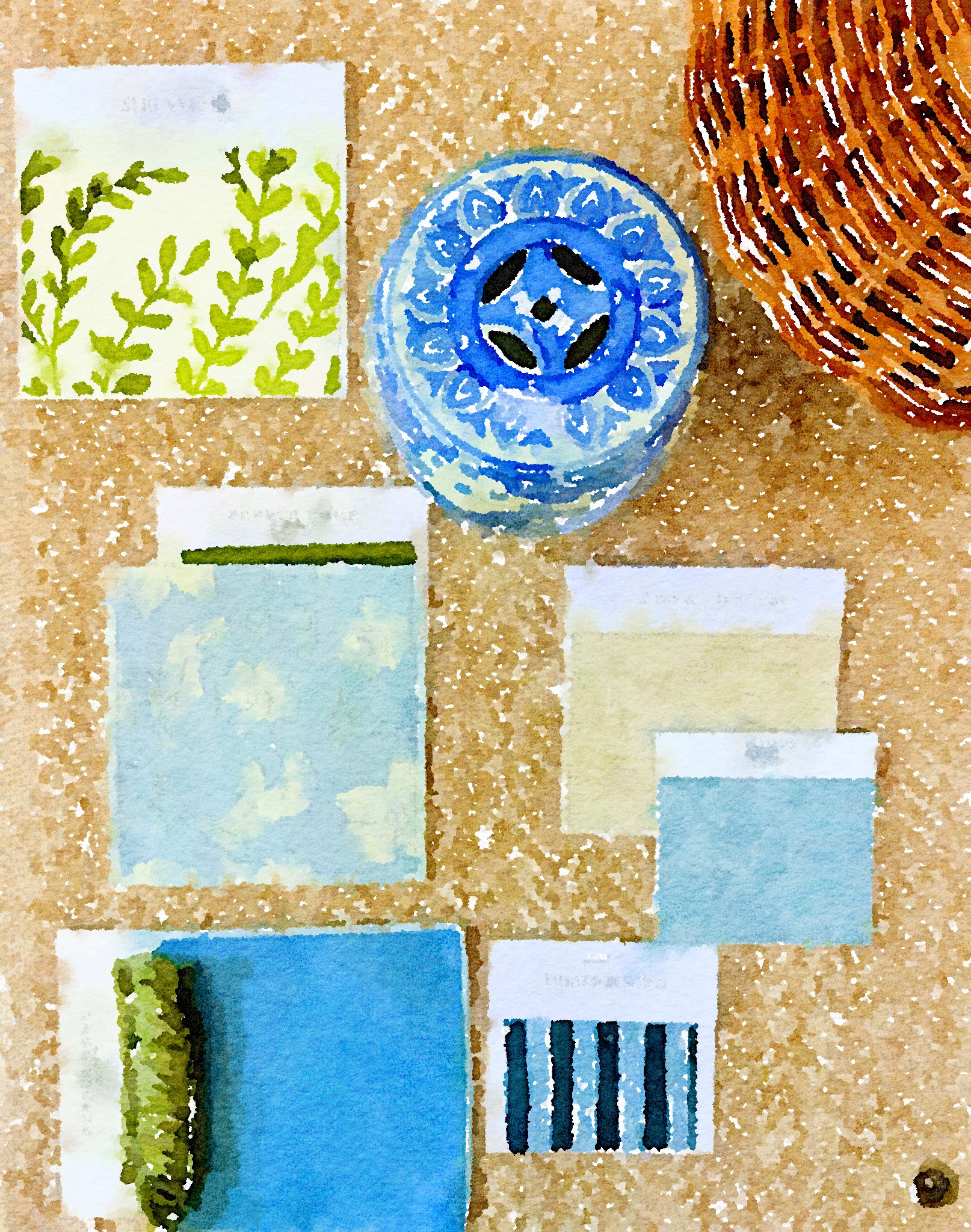
Color never exists in isolation. Natural light shifts throughout the day, north-facing rooms pull cooler, south-facing rooms amplify warmth, and artificial lighting alters undertones entirely once the sun goes down. A color that feels perfect on a paint chip in the store can look completely different once it's on your walls at home. Before committing to any paint color, sample it on multiple walls and observe it in both morning and evening light, always comparing it against your flooring and cabinetry. Testing colors isn’t indecision, it’s part of your color strategy.
Anchor with neutrals, layer with color
In a forever home, the permanent elements should feel enduring. Flooring, cabinetry, large upholstery pieces, and tile should all lean neutral and timeless, with color layered in through accent chairs, pillows and textiles, art, lamps, and decorative accessories. This approach gives you real flexibility. As your tastes evolve over the years, you can shift those layers without having to redo your foundational elements. Color should enhance your home, not trap it in a single season of life.
Create a whole-home palette
The most beautiful homes don't feel like a series of separate rooms stitched together. They share a cohesive palette where the colors relate to each other, even if every room isn't the same color. Think of a soft smoky blue in the dining room flowing into a muted blue-gray in the living room, with a warm white carrying through the main spaces. Each room transitions naturally into the next rather than competing for attention. Before you paint a single room, define one to two foundational neutrals, one to two supporting hues, and one to two accent tones. This becomes your home's visual language, and everything you add after that has something to anchor to.
Color is emotional
Beyond theory, color influences how you actually feel inside your home. Soft greens calm the nervous system, warm whites feel nurturing, and deep blues feel grounding. Your home should support the way you want to live, not just the way you want it to photograph. When color decisions are intentional, your home feels aligned and calm; not trendy or chaotic.
Ready to create a cohesive color plan?
If choosing paint colors feels overwhelming, it's usually because you're making isolated decisions without a full-home vision in place. Finally Finished: A Forever Home Blueprint walks you through defining your overall aesthetic direction, creating a whole-home color palette, selecting timeless finishes, and planning upgrades in the right order. Stop second-guessing every paint swatch. Download the Finally Finished: A Forever Home Blueprint and design your home with clarity, cohesion, and confidence.